01 / Global Campaign
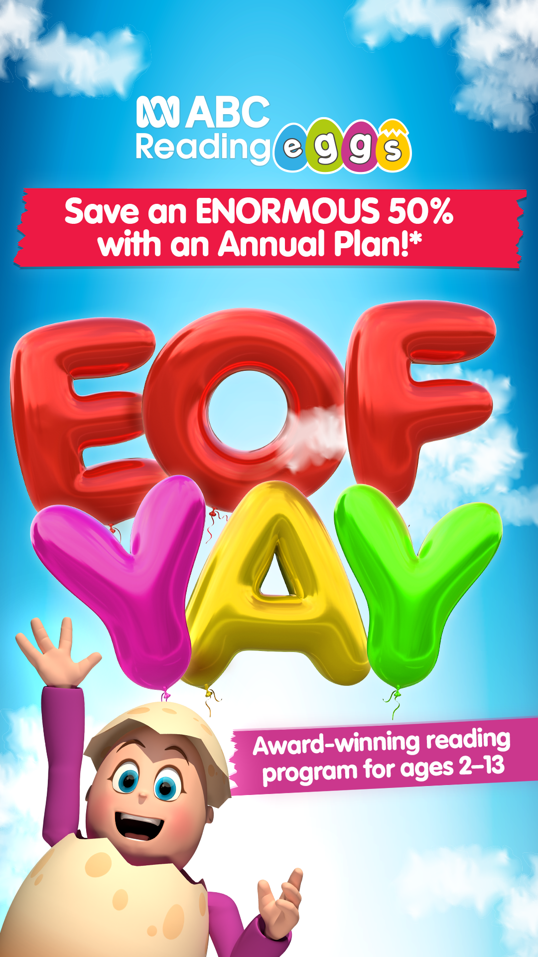
FY24—25Successfully refreshing Reading Eggs' Black Friday sale.
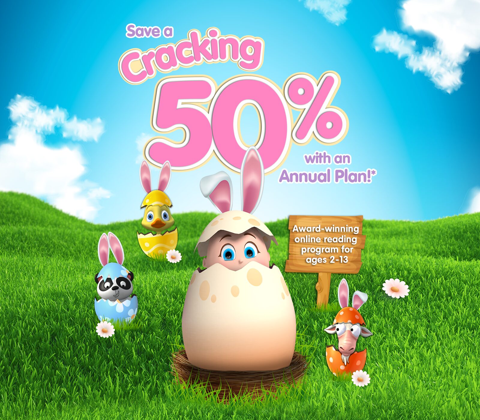
Challenge: Reading Eggs is a global edtech app that helps children aged 3+ learn to read. The marketing team had run the same Black Friday sale creative for five years running, with results plateauing. The campaign required a creative refresh to boost engagement and sales.
Read moreShow less↓
Brief: Increase Black Friday and Cyber Monday sales globally while decreasing cost per acquisition with a refreshed sales campaign.
Solution: A fresh but simple and visually engaging concept that could work as a teaser, the sale period, and a final push across Cyber Monday. This simple design concept worked as a narrative for the customer, was visually striking, landed the key messages, and allowed for consistent integration across all marketing channels (social, display, email, in-app, and custom landing pages).
Results: $1.5M in Black Friday & Cyber Week sales, 4 percentage points over target.
Key details:
- Original concept, strategy and execution across three regions (APAC, EMEA, AMER).
- Implemented batch-processing actions and automation within Photoshop to handle high-volume formatting at scale.
- Utilised Canva by creating modular templates for re-use across regions, allowing marketing teams to adapt and localise assets for their specific markets.
- FY24 success allowed for further iteration and evolution of the campaign in FY25.
- RoleGlobal Head of Design, 3P Learning
- ChannelsPaid & Organic Social · EDMs · Web · 3P Ads
- ToolsPhotoshop · Illustrator · After Effects · Canva